Gemini_Generated_Image_rka1f5rka1f5rka1.png
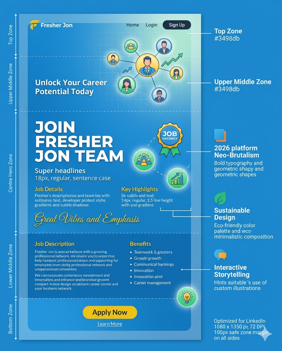
The image has a clear and organized structure, with a prominent headline and sections for job details, key highlights, benefits, and a call-to-action. However, some text is blurry and hard to read, particularly in the job description and benefits sections.
- Increase font size for body text to at least 16px
- Improve font contrast with background for better readability
- Use clear and concise language in job description and benefits sections
The color scheme is predominantly blue, which conveys trust and professionalism. However, the use of yellow and green is somewhat inconsistent and may not be accessible for color-blind users.
- Limit color palette to 3-4 main colors for better consistency
- Ensure color contrast meets accessibility standards (WCAG 2.1)
- Use color more strategically to draw attention to key elements
The layout is generally well-structured, with clear sections and ample whitespace. However, some elements feel cramped, and the image could benefit from more visual hierarchy.
- Increase spacing between sections for better breathing room
- Use clear headings and subheadings to create visual hierarchy
- Consider a more prominent hero image or graphic
The image has a good balance of text and images, with clear graphics and icons. However, some sections feel text-heavy, and the image could benefit from more visuals.
- Add more images or graphics to break up text
- Use icons more consistently throughout the design
- Consider using a video or interactive element
The call-to-action (CTA) button is prominent and well-placed. However, it could be more attention-grabbing, and the surrounding text could be more persuasive.
- Make CTA button more prominent with contrasting color
- Add a sense of urgency or scarcity to encourage action
- Use action-oriented language in CTA text
- Clear and organized structure
- Effective use of color and typography
- Prominent call-to-action
- Improve font readability and contrast
- Increase spacing and visual hierarchy
- Make CTA button more prominent
- Conduct A/B testing to optimize design elements
- Gather user feedback to identify areas for improvement
- Ensure design is responsive and works well on mobile devices